


01. »bdtronic Planning« – UX/UI
Platform Design
bdtronic is an important company in the electrical industry. They offer solutions for dispensing, impregnation, heat staking and plasma worldwide. With more than 580 employees they bring services to the automotive sector, as well as the medical, telecommunication and energy sector among others.
Due to their constant growth and with so many employees and services, they were in the need of a planning platform that could manage time, processes and workers in all areas and for each production phase.
Together in dev:term, our team consisting of project manager, developer and me as UX designer, we created a b2b concept proposal for a highly specialized planning platform that is personalised to the company needs and flexibel enough to reduce time delays challenges.
Together in dev:term, our team consisting of project manager, developer and me as UX designer, we created a b2b concept proposal for a highly specialized planning platform that is personalised to the company needs and flexibel enough to reduce time delays challenges.
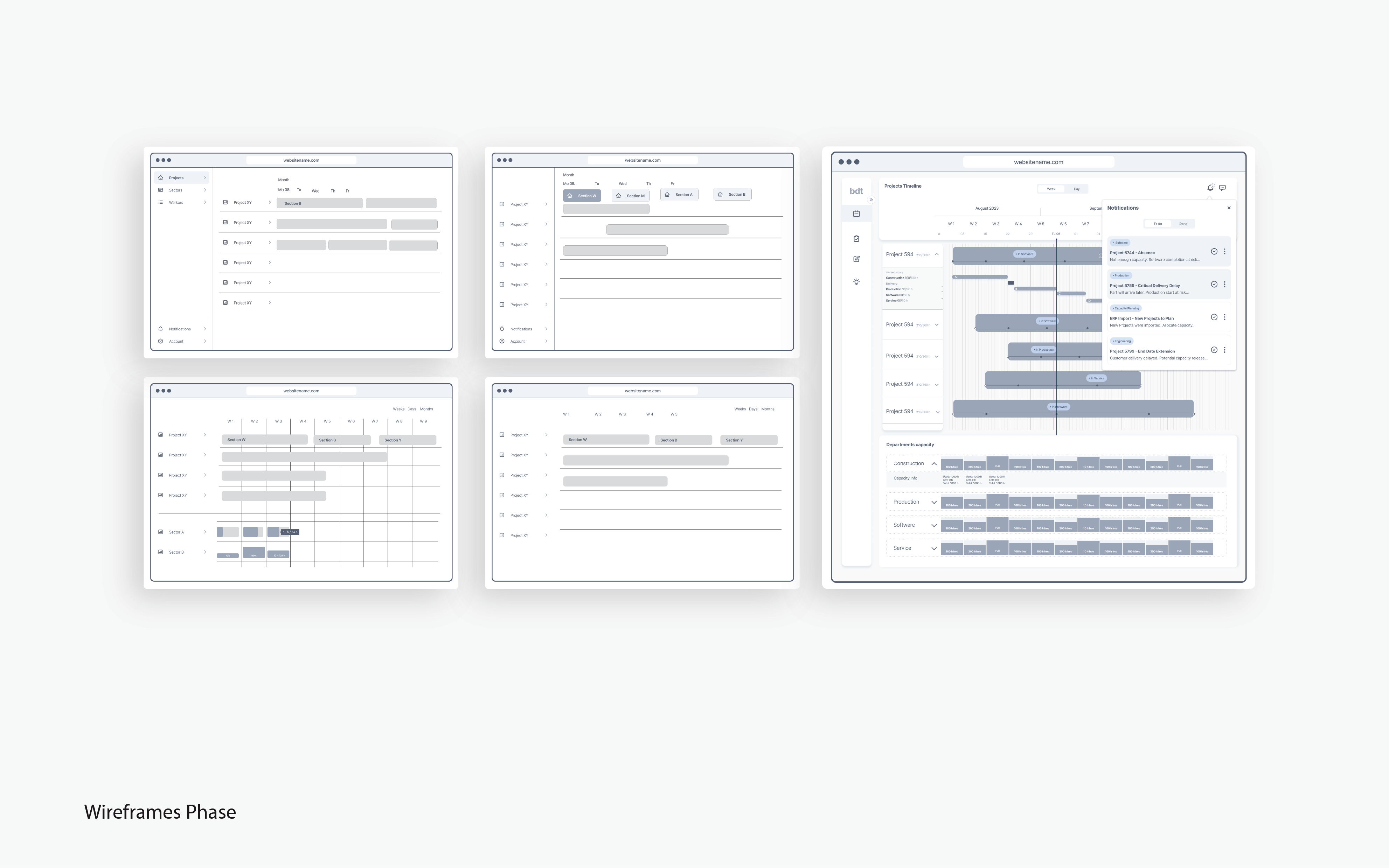
My role was to create the UX of the platform, and with very complex system and requirements from the client, I needed to transform complexity in efficient solutions.
I started with the empathy phase, understanding the requirements, finding the pain points and the problems that should be adressed for a helpful functionality. After gathering information and doing some market research, I builded a user journey, considering three different users: the project managers, the area managers and the employees.
I started with the empathy phase, understanding the requirements, finding the pain points and the problems that should be adressed for a helpful functionality. After gathering information and doing some market research, I builded a user journey, considering three different users: the project managers, the area managers and the employees.
The different areas of the company as well as the different phases during projects were of great importance to build first a clear overview tool and later a more detailed planning within each sector. With user flows for the three main users, it was possible to create useful wireframes and mockups. After feedbacks, adjustments and approval, I made high-fidelity prototypes as end result for this platform proposal.
user experience, user interface, design thinking, solution for complex system
user experience, user interface, design thinking, solution for complex system


02. »Air Finance & Insurance« – UX/UI Platform Design
I worked on the project of redesign the UX and UI for Air, an interactive platform, where the user can manage his finances with an overview of his incomes, expenses and plans for the future.
This platform started as a b2b project, where the end user was guided by companions from the Air company. So the old design was mostly long forms to fill out and print by the companion, who made all the calculations for the end user, in order to suggest some financial advices.
As the company changed to improve its digitalisation, the new goal was to give the end user a platform for an individual use without the need of a companion, so the end user could manage and improve his finances by him self. So my challenge was not only to improve the user experience but also to redesign the whole platform to change it from a b2b to a b2c project with the end user in mind.
The requirements from the client were: It should be simple and light, understandable and flexible, free of charge and non-binding.
The requirements from the client were: It should be simple and light, understandable and flexible, free of charge and non-binding.
The goals of the user experience were for the user to get an overview of the finances, consider his life wishes, create a balance by accounting his incomes and expenses and finally experience a »wow effect« with the results.
My work included the redesign of the platform improving the usability, adapting the design system and creating new components. As the topic of finances can be a very heavy topic, I aimed to ease as much as possible the user experience and clarify the interface design.
My work included the redesign of the platform improving the usability, adapting the design system and creating new components. As the topic of finances can be a very heavy topic, I aimed to ease as much as possible the user experience and clarify the interface design.
Another task for Air, was to create a new service inside the platform for insurances, where the user could get personalized offers of insurances with his given wishes and plans for the future. My role here, was to design this new service from scratch, with an appealing user experience and a simple understandable usability on the layout. I molded the concept, made the research, the ideation and finally the mockups and prototypes, with the supervision of my project manager and the direct feedback of the client.
user experience, user interface, usability, accesibility, design thinking
user experience, user interface, usability, accesibility, design thinking


03. »Good Intentions« – UX/UI Interactive Platform
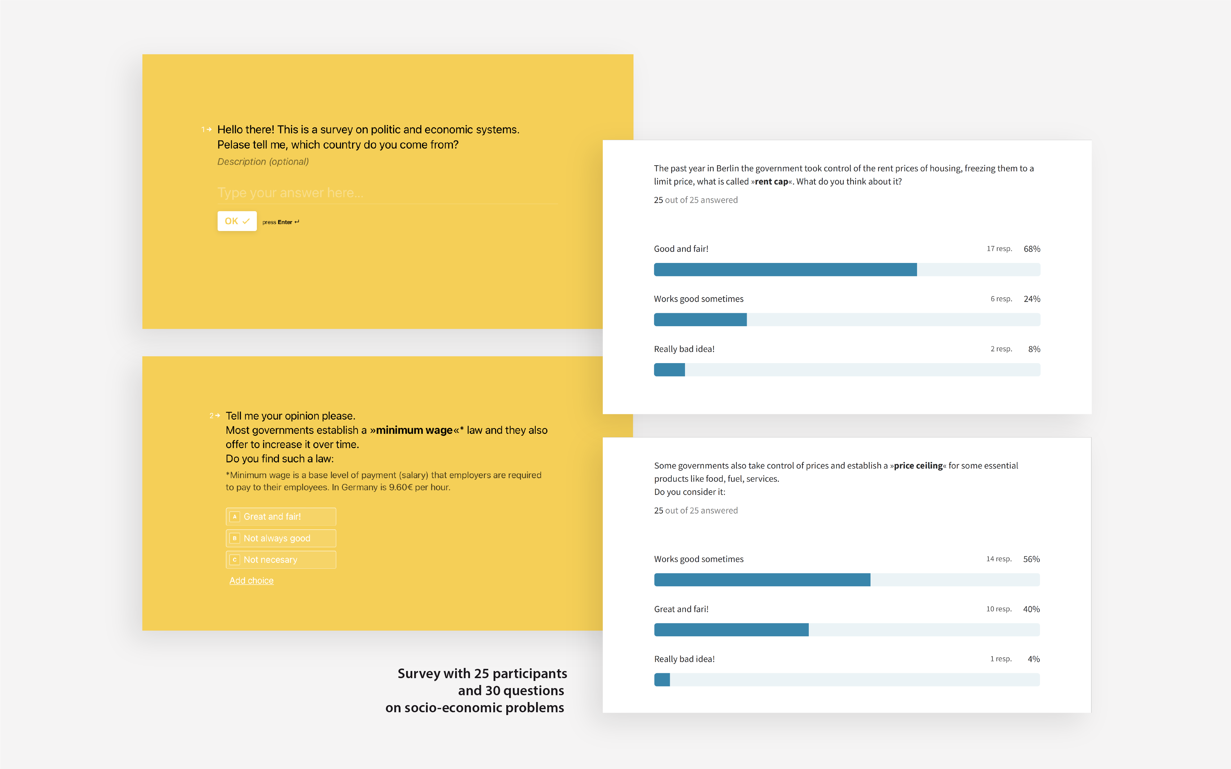
Friedrich von Borries says »Design is political because it intervenes into the construction of the world«. With this in mind, I started to analyse how ideology works and how does design contributes on the use of ideologies as political instruments.
My research started with philosophy, semiology and psychology. After gathering information and theories on the topic of ideologies and understanding its different functions, I started with the field research doing interviews and surveys on different ideological and political positions.
My intention is to visualise complex systems that affects our daily life. The topic I chose, is mainly socio-economic problems that have been often approached from different ideological perspectives. I visualise this problems bringing clarity and access for better understanding.
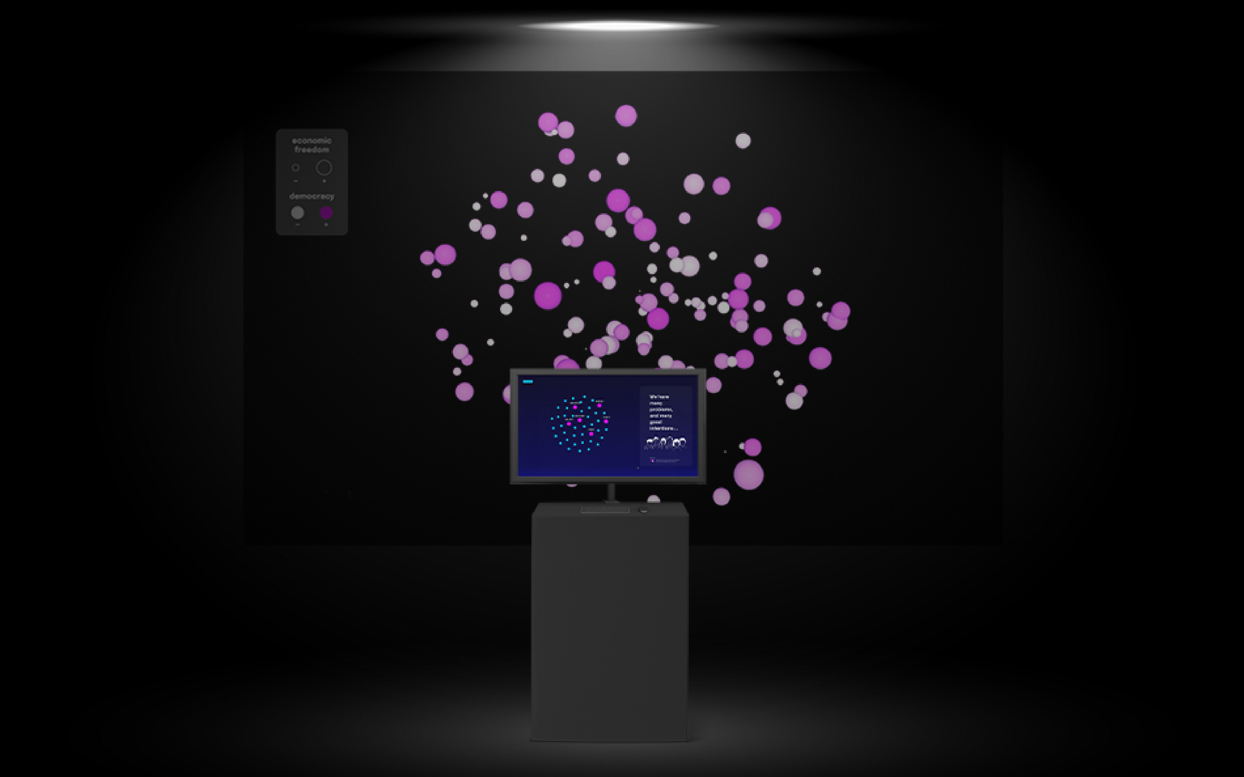
This interactive platform, as part of a small interactive installation, is a website coded with java script and the D3 library, intended to visualize a network of »good intentions and its consequences«.
This interactive platform, as part of a small interactive installation, is a website coded with java script and the D3 library, intended to visualize a network of »good intentions and its consequences«.
Groups of information on different economic daily-life problems are placed as a galaxy. Users can click and see what could happen after some particular »well-intended« political decision is taken and how people can be affected by it.
I want to show what people don’t see, how topics get connected to one and other in a web, and what stories behind appear in every economic movement.
d3.js, ux|ui, interaction, data visualization
I want to show what people don’t see, how topics get connected to one and other in a web, and what stories behind appear in every economic movement.
d3.js, ux|ui, interaction, data visualization

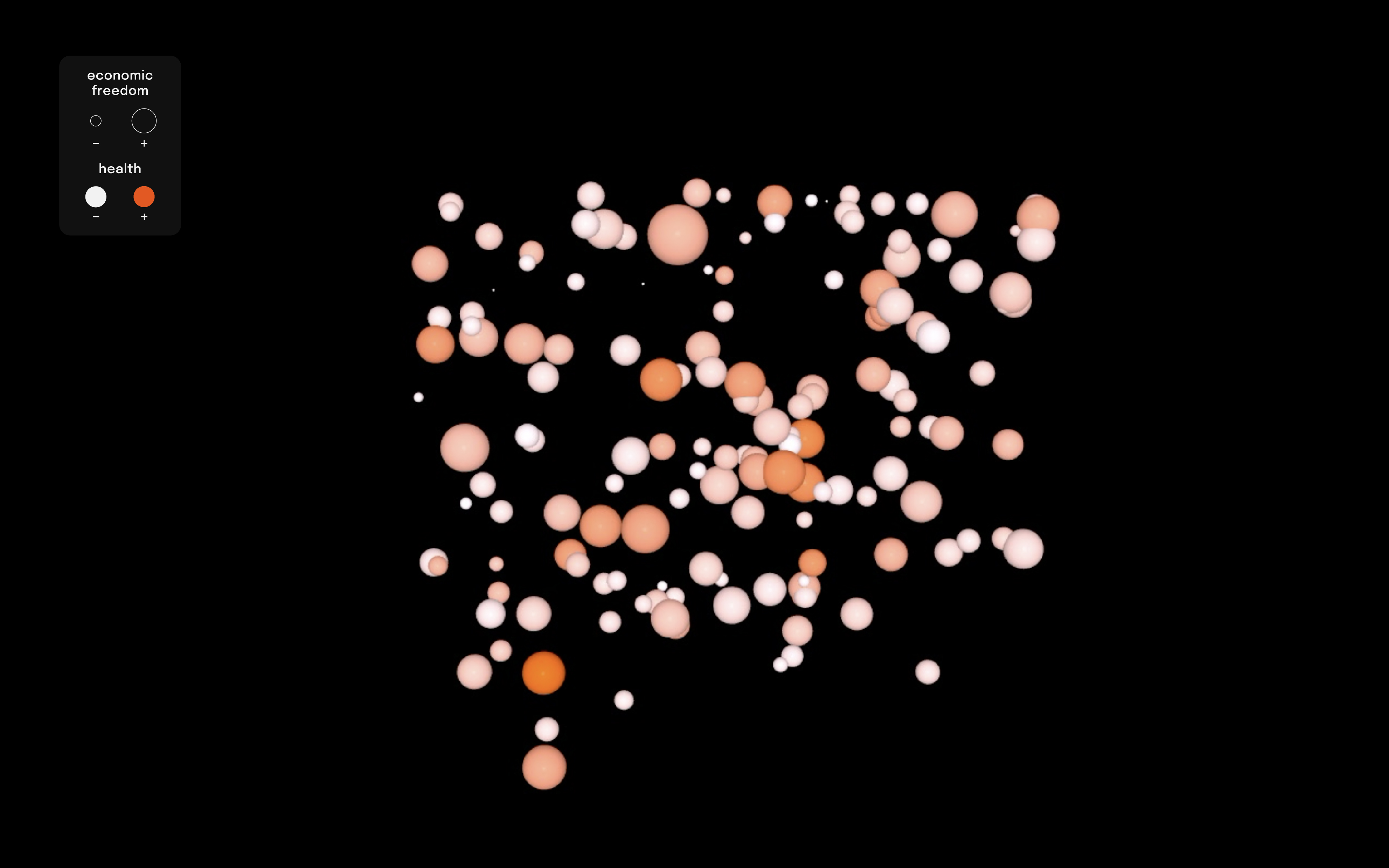

04. Economic Freedom – Data Visualization
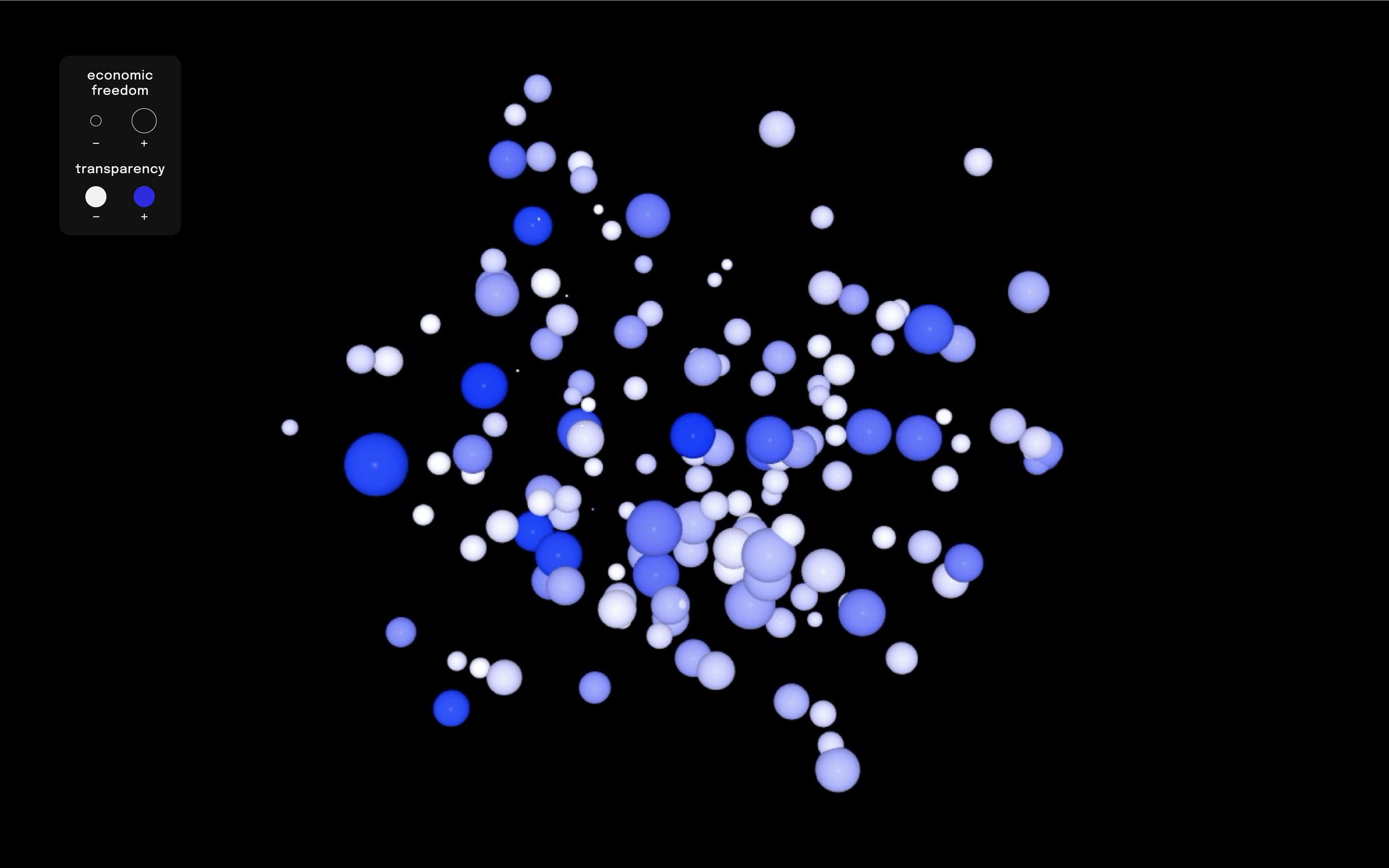
This projection is part of an exhibition designed for my Master Thesis on Integrated Design at the Köln International School of Design.
I created the concept and prototype for a small interactive installation, that consists of a world data visualization in an abstract form and an interactive informative platform.
The data visualization projection is the result of transforming data sets into graphic moving elements done with Touchdesigner.
The data sets recollect scores on economic freedom and compares it with scores for health systems, democracy level and government transparency around the world.
touchdesigner, ux|ui, interface,
data visualization
The data sets recollect scores on economic freedom and compares it with scores for health systems, democracy level and government transparency around the world.
touchdesigner, ux|ui, interface,
data visualization